Website Homepage Content (What You Need to Include)
With three new websites created every second, your website needs to stand out and include content that attracts your target market, connects with your audience, and builds trust.
In this article, we’ll discuss what website homepage content you need, including branding, keywords, social proof, and calls to action. I’ll also share website homepage examples you can use for inspiration.
What content should I put on my home page?
The content for your website homepage should showcase your brand and clearly communicate who you help and how.
Branding
“Branding for your business is like a shop window,” says Jen Raffles, a Graphic Designer with Magic Feather Designs. “It needs to look great, turn heads, and let those passing by know what you’re about and if you’re for them.”
Raffles also says to think of the shop window being full of the best-selling products (visual hooks). There’s a specific color scheme that sets the tone of your business. At a passing glance, your shop window or website homepage needs to attract your target market and pull them in, and this is where branding plays a role.
“Branding is more than the design or visuals,” Raffles says. Elements like business values, vision, voice, vibes, ideal customer, goals, and marketing requirements play a role in creating a brand with purpose.
A typical brand design from a designer like Raffles would include your:
Logo suite - various logo options because one size doesn’t fit all
Color palette - complimenting colors based on color psychology
Typography styles - a set of different font designs to set the right tone
Brand marks/elements - symbols and images for brand personality
Brand packages may also have other elements, but necessary branding for your website homepage specifically includes:
Your primary logo
Brand elements
A hook that lets your ideal client or customer know they’re in the right place
On-brand images
Consistency with colors and fonts
Keywords
SEO (search engine optimization) keywords help your target audience find your website on Google. Your primary keyword for your homepage should tell Google and your reader what your business helps with. For example, the primary keyword for my homepage is “SEO writing services.”
You want to choose a keyword that gets traffic. Usually, when we choose keywords, we also want ones with low competition.
However, your homepage's keyword is typically broader, and unless you have a unique niche, there will be competition. That's okay because you can target more specific, lower-competition keywords on other pages of your website, like service pages and blog articles.
My favorite keyword research tool is Keysearch, where you can find more than a billion potential keywords. To find the best keyword for your homepage:
Consider the service(s) or product(s) you offer
Choose a phrase you think your target market might search Google for
Search Keysearch for this phrase and see what shows up (there will be many ideas)
Select a relevant one that has moderate to high traffic
Use the Content Assistant feature to get related keywords to sprinkle into your homepage
Try Keysearch free for seven days.
Headline
Your headline, or H1 in SEO terminology, is the first bit of text your visitors will see when they land on your homepage.
Your headline should:
Tell your audience exactly what your business is
Avoid jargon or confusing language
Include your primary keyword
My website homepage headline, “SEO writing services to help you increase organic website traffic,” includes my primary keyword and tells audience my audience what my services are and how I can help them:
Use your headline to tell your audience what you do
Subheadline
Your subheadline is just below your H1 or main headline. It should be one to three sentences and give further details to explain your offer(s) and the value you provide your target market.
You can also include a secondary keyword in your subheadline to ensure Google and your audience understand what your company does and who you help.
My client, Oakwell Cosmetics’ subheadline is “nourishing beer-infused skin and hair care products that work beautifully for everyone.” It tells what they sell and who they sell it to.
Use your subheadline to speak to your audience on how your offers help them
Calls to action
A call to action (CTA) is crucial because it tells your audience what action to take (i.e., schedule a call, read an article, buy something, etc.). Choose calls to action that make sense for your goals and the person who lands on your homepage.
As you can see in the headline and subheadline examples above, you should have a CTA above the fold–the top of your homepage before the user scrolls.
You can have two to three calls to action, but don’t overdo it. Too many CTAs can be overwhelming or confuse your audience.
Here are some insightful statistics on best CTA practices:
Doubt removers can increase conversions up to 124% (Doubt removers are points that remove potential concerns, like “money-back guarantee” or “# happy customers.”)
CTAs surrounded by white space can increase conversions by 232%.
Buttons over text CTAs can increase conversions by up to 32%.
A large, dark CTA button can increase conversions by up to 58%.
My client, Virgin Kayak Tours, has an effective CTA because it’s straightforward and tells the user exactly what the next step is (book your trip):
Use CTAs to encourage your audience to take action
What you do
Once you scroll below the fold (the top section with your headline, subheadline, and CTA), go more into what you do. But don't make it about you; make it about your audience.
Your homepage should make it clear:
Who you help
What your offers are
What problems you/your offers solve
Have a few people test your homepage and report back with what you do, who you help, and why. If they’re unsure, update your homepage to make this more apparent.
Beth Rawlins with Pie Heart Studio does this well, as you clearly know what she does with her above-the-fold content. Then, she provides more details further down on her homepage.
Tell what you do above the fold in your headline and subheadline
Below the fold, expand on how your offers help your audience
Visuals
People process visuals 60,000 times faster than text. Visuals that share useful information can also engage your website visitors. It’s no wonder why websites with visuals drive more results.
Visuals to include with your website homepage content:
Images of you (if you’re a service provider)
Images of your product(s) (if you sell e-commerce)
Client/customer reviews with star graphics
Case studies with results
Videos of your products and/or client/customer reviews
Easy-to-follow navigation
Where do people go after they land on your homepage? For conversions, you want to make it easy for your audience to stick around.
Create easy-to-follow navigation with:
A drop-down menu at the top of your homepage
A few call-to-action buttons throughout the page
Readability with simple text and dark fonts over a light background.
Images for accessibility (i.e., social media buttons icons)
Testimonials/reviews
Reviews can make or break your credibility. 98% of consumers read online reviews, and 46% feel reviews are as trustworthy as recommendations from friends and family.
Sprinkle reviews throughout your website, and especially on your homepage.
Tips for displaying testimonials/reviews:
Encourage clients/customers to share feelings and results
Mix written and video reviews
Put as much information as possible with your reviews (i.e., client/customer name, location, image, etc.)
Get permission to share reviews and any information you include with it
If you have a Google Business Profile, you can embed or copy reviews to your website
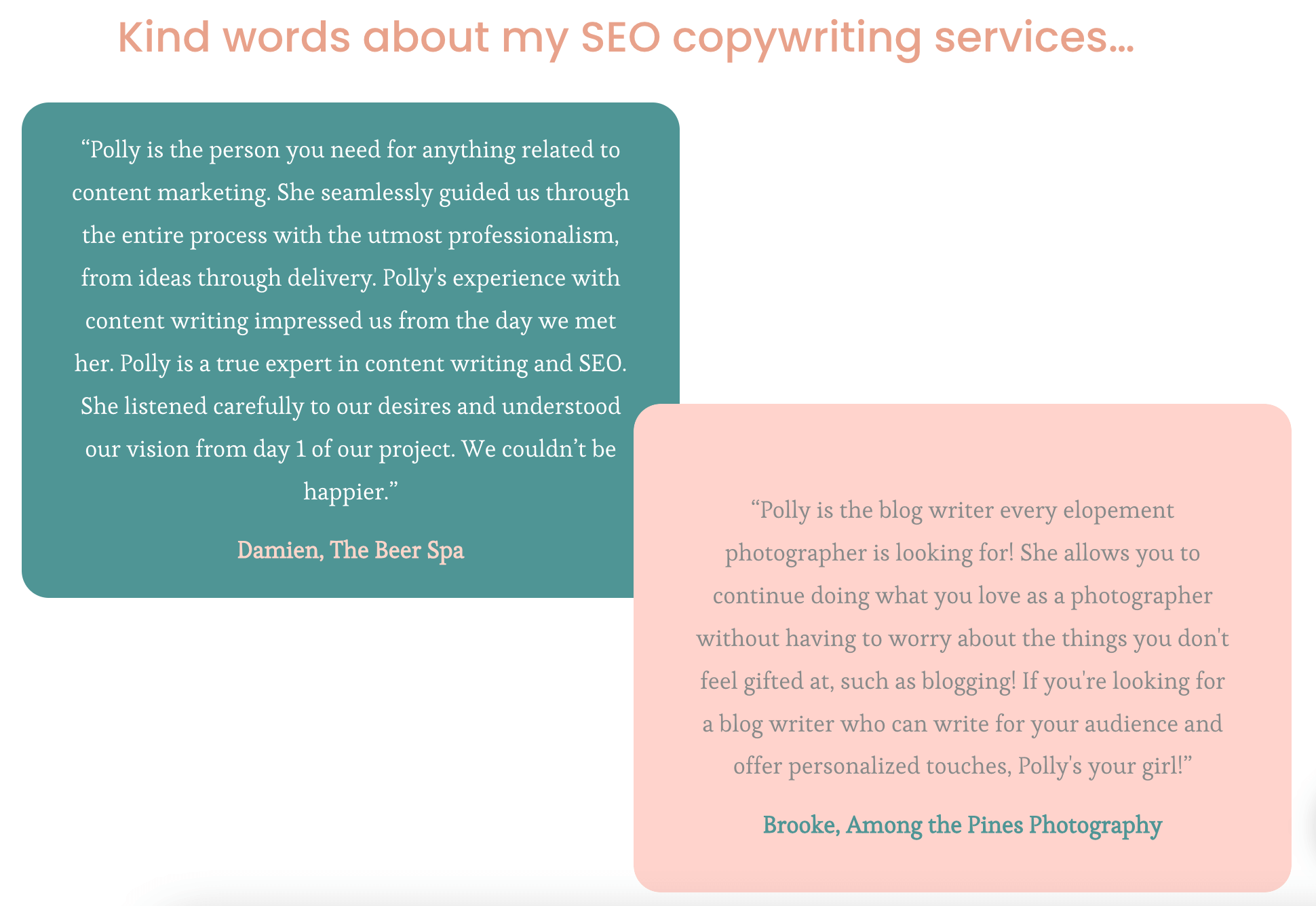
Here’s how I have a couple of reviews displayed on my homepage:
Display testimonials/reviews to build credibility
Success indicators
Success indicators take customer reviews to the next level because they showcase specific achievements.
You can include awards and recognitions you’ve achieved, how many clients or customers you’ve served, or how many years in business.
Burt's Bees does this well by displaying their top accomplishments on their homepage:
Use success indicators to further build trust
Other ways to connect
How often do you Google something, click on a website, and never go back to that site? We do this often.
Make it easy for your website visitors to stay connected with you by sharing other ways to connect. You can do this with social buttons (i.e., Instagram and Facebook) and an email list sign-up.
You can display social buttons at the bottom of your homepage, which is where most people will look for them. Most website builders have an option for you to easily add social accounts and icons.
An email list is my favorite way to stay in touch with my website visitors. I have a few freebies my audience can download by sharing their email address. Use Canva to design a helpful freebie and Flodesk to create a freebie sign-up form to embed on your homepage and/or as a pop-up.
Website Homepage Content Examples
Here are effective website homepages with content that helps my clients connect with their target audience, build trust, and reach their goals.
Nomad Finance and Freedom
Nomad Finance and Freedom is a blog that provides resources to business owners, freelancers, and digital nomads.
This website homepage works well because it has:
A headline and subheadline that clearly indicates who the site is for and what it offers
Cohesive branding that feels easy to connect with
Easy navigation for users to get the most from the site
Ways to connect to help the brand grow its audience
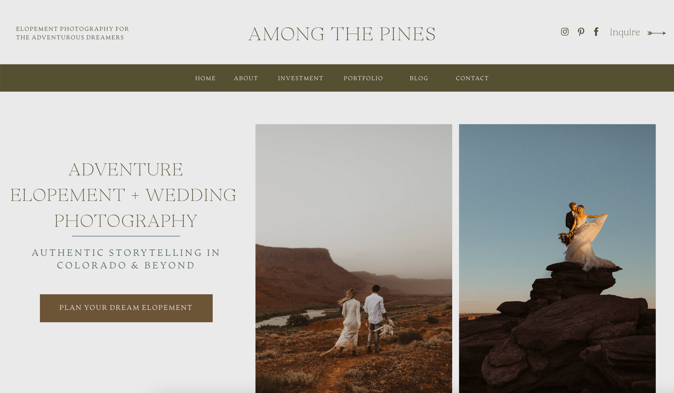
Among the Pines Photography
Among the Pines Photography is an elopement photographer who works with adventurous couples who want to elope.
This website homepage works well because it has:
A concise headline and subheading
Various calls to action to direct the audience to take action
Images to showcase her work and connect with her target audience
Social buttons that are easy to see
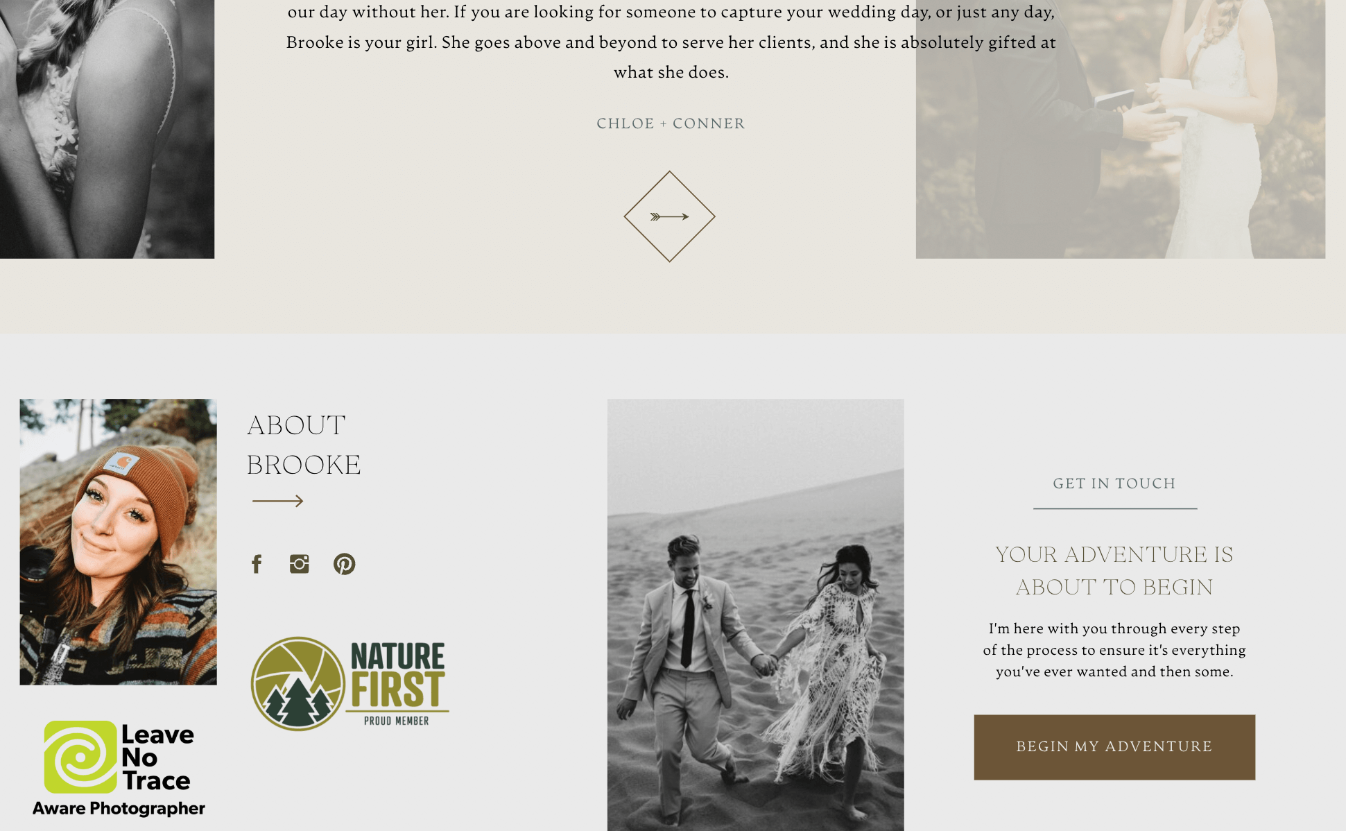
Client reviews for social proof
Success indicators to build credibility with her targeted audience (Nature First Member and Leave No Trace Aware Photographer)
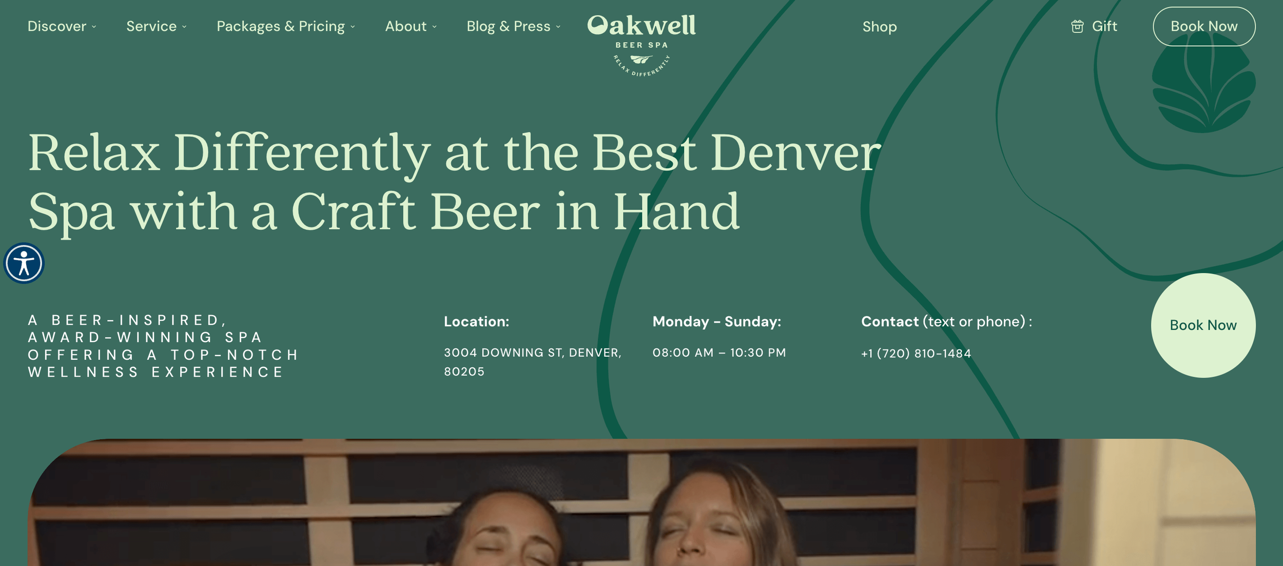
Oakwell Beer Spa
Oakwell Beer Spa is a day spa in Denver, Colorado, that focuses on attracting Denver locals and visitors who want to book a spa day.
This website homepage works well because it has:
Branding that offers a calm vibe to match their services
A heading and subheading that speaks directly to their audience
Various visuals, including images, videos, and graphics to engage users and provide helpful information
Straightforward calls to action throughout the page to keep users on the site
Email newsletter sign-up and social media buttons to stay connected with their audience
Website Homepage Content: FAQs
Make the most of your homepage by getting answers to common questions about content for your website homepage.
Why is your website homepage content important?
Many people will only look at your homepage before deciding to do business with you, so it must make an impact.
Think of your website homepage as the structure of your home. It’s necessary for your website's existence, and high-quality, accessible, and useful content supports your business’ success.
Can I use Canva for branding?
If you’re a new business owner, you might not have the budget to hire a designer to help you with branding. I recommend budgeting to hire a professional, but in the meantime, you can use Canva to get started with minimal branding.
Canva is an online graphic design tool that makes it easy to create a logo and color palette. That said, if you create a logo on Canva, you can't trademark it. While you can use it, Canva has legal rights to it, so it's best to hire a brand designer for full-service branding when you can.
How many keywords should my homepage include?
Your homepage can include 3-5 related keywords your target audience might search Google for.
With most web pages, you only want to target one primary keyword with a few secondary keywords. But your homepage is a pillar page for your offers, so it’s okay to sprinkle in various keyword phrases that are similar to each other. This gives Google and your audience a good idea of what your website is about.
For example, I’m a website copywriter who specializes in blogging, so I have a few high-traffic keywords on my website homepage: “SEO writing services,” “SEO blog writing services,” and “SEO copywriting.”
Website Homepage Content: Conclusion
I hope you found this article helpful in preparing your website homepage to attract, connect with, and convert your ideal client or customer.
The content for your website homepage should include cohesive branding, information that tells your audience how you help them, other ways to connect, and reviews and social proof for building trust.
If you need help getting started with or improving your website homepage, check out my Website Consultation service, where I answer specific questions and offer actionable steps to help you make the most of your website.


