What Makes a Website Good (Stand Apart From Your Competition)
With almost 2 billion websites and counting, it's more important than ever to have a good website that stands out. In this article, I'll share what makes a website good. You'll learn how to create a website that ranks on Google, reaches your target market, and generates more income.
Although there are so many websites to compete with, many aren't successful because they’re not user or Google-friendly. This makes your chances of ranking better.
Continue reading to learn how you can optimize your website for success.
What Makes a Website Good in 2024
If you have a good website, Google ranks it to show it to users who are searching for something you can help with. A good website is also about your audience and their experience.
Here are 8 essential qualities of a good website:
Branding
Must-have webpages
User experience
Mobile-friendly
Valuable content
Search engine optimization (SEO)
Accessibility
Calls to action
Branding
Branding is one of the most critical factors for a successful business and website. Cohesive branding is a simple way to be unique, stand apart from your competition, and build trust with your audience.
Branding includes:
Colors - use color psychology to create a color palette (e.g., blues represent wisdom and trust; purples represent spirituality and wealth; greens represent wellness and nature; yellows represent happiness and optimism)
Typography - two or three fonts that represent your brand’s vibe
Logos - a symbol or design that helps people immediately identify your brand
Tone of voice - the personality of your brand and the way you speak to your audience (your tone might be relaxed, professional, quirky, empathic, or a mix)
Mission - what your company stands for, who it helps, and why
Vision - the goals you have for your brand
You can DIY your branding with Canva, or you can hire a brand designer. I worked with Magic Feather Designs, who helps with website, brand, and graphic design.
Must-have webpages
Every good website requires various web pages. The more pages you have, the better your chance of appearing in search results and reaching your target market. With more pages, you can share more content that tells Google and your audience what your business is all about – who you help and how you help them.
Here are must-have web pages for every successful website:
Homepage: summarizes your entire business and website
About page: tells the reader how you can help them
Contact page: makes it easy for people to connect with you
Services or products page: showcases your offers and how they benefit your audience
Blog page: educates and entertains your target market and encourages them to buy from you
User experience
Although most of what makes a website good affects user experience (UX), this is so critical it deserves a section of its own. In fact, 90% of users won’t return to a website if they have a poor user experience.
The top factors that impact user experience are page load time, navigation, and design.
Page load time
Page load time is how long it takes a page on your site to load when someone gets to it. Loading time should be 3 seconds or less.
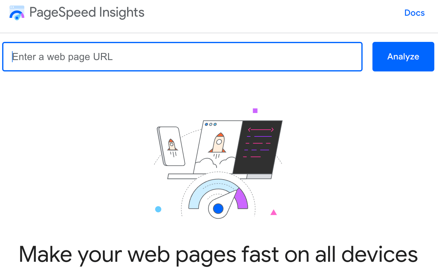
You can use PageSpeed Insight to learn what your load time is for your web pages and how to improve them.
Navigation
Your website’s navigation is how everything connects and users get from one place to another. You want your navigation to be straightforward and easy to understand.
A few essential navigation features are:
A drop-down menu, which is usually at the top of your homepage
Buttons throughout your website that take users elsewhere
Clear calls to action that are easy to understand (i.e., "Blog" is more clear than "Journal")
Easy to read with a dark font that isn't too small and contrasting colors
Design
Design can affect the entire user experience. A nicely designed website is always better than a poorly designed one.
A suitable website design is one that:
Is aesthetically pleasing
Isn't too busy
Has an easy-to-understand and navigate layout
Has readable font
Mobile-friendly
Mobile users are 5 times more likely to leave a website if it’s not a good experience. In today’s time, this means you can lose a lot of site visitors and potential customers or clients.
Depending on your niche and audience, many users will likely access your website from their phones. Most website builders allow you to view and edit your site's appearance on desktops and mobile devices.
I use Squarespace for my website, which I highly recommend, and it makes it easy to edit and view appearances on various platforms.
Your website should be desktop and mobile-friendly
Valuable content
Every great website incorporates value. This is what keeps people on your website.
To create valuable content, you must know:
Who your target market is
What their pain points are
How you can help them
Every piece of content on your website should have your audience in mind. If it’s not valuable, don’t include it.
Not only should your words be helpful, but you should also have useful visuals. This includes images, charts, and videos.
For example, this blog article is valuable because it tells you exactly what makes a website good and includes pictures that provide further information.
Search engine optimization (SEO)
SEO is the talk of the town for websites in 2023. These are techniques you use that tell Google what your content is about and that it’s helpful for users.
When you optimize your site for SEO, it ranks higher because Google understands who you can help and how you help them.
For example, if you have SEO-friendly blog articles that cover topics your target audience is interested in, Google will rank your content to attract people to your site. This is essential for getting website traffic, which you need for people to learn about and invest in your offers.
SEO → website traffic → business growth
Accessibility
An accessible website is one that anyone can access, read, understand, and use.
In a study of more than 30,000 websites, there was an average of 110 accessibility errors per page. Not only is website accessibility a legal requirement, but everyone deserves to be able to browse the internet with ease.
Don’t let the legal aspect scare you. It’s actually quite simple to create an accessible website if you put in the effort.
To ensure all users can access your content:
Avoid complex language - Website content shouldn’t be above the 8th-grade level. You can use Hemingway.com to check your difficulty level.
Use short sentences and paragraphs - Sentences should be less than 25 words, and paragraphs should be less than 5 sentences. Leave out any unnecessary fluff.
Include alt text for images - Briefly describe what’s in the image.
Add video captions
Use easy-to-read font - Fonts should be dark over light backgrounds and a font size of 16px or larger.
Include headers - Headings (or headers) are bigger than the regular font, and structure your content to make it easy to skin.
Create descriptive URLs - For example, the URL for this article is “what-makes-a-website-good,” which clearly tells the user what the topic is.
Avoid using too many tables - These are difficult for screen reader software to read. If you use tables, include headers for each row and column.
Allow keyboard navigation - This lets users explore your site without a mouse and use “tab,” “enter,” or “return,” arrows, and the space bar.
You can find further guidance on website accessibility as required by the Americans with Disabilities Act (ADA) here.
Calls to action
When people are on your website and having a good experience, calls to action (CTAs) tell them what to do next. This is where conversions happen.
Consider your goals for your website. What do you want your audience to do? Calls to action can vary from page to page.
CTAs or next steps could be:
Fill out your contact form
Purchase a product
Download your freebie
Sign up for your email newsletter
You want your call to action to be easy to understand. Some people try to be catchy with theirs. They might use something like “Count me in!” However, this could be confusing for some users.
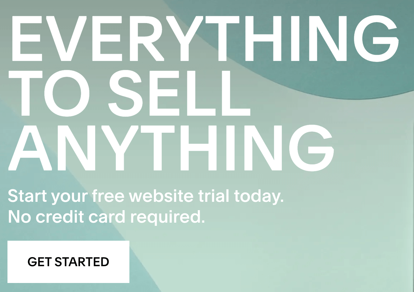
This straightforward call to action on Squarespace’s website is ideal:
Squarespace example of a call to action button
Other good CTA examples are:
Shop merch
Download my freebie
Start now
Save my seat
Sign up
Good website examples
Here are a few of my favorite examples that demonstrate the features of a good website:
Bod drinks: a drink company with a website that’s easy to read and navigate and aesthetically pleasing
Jessica Digital: a marketer’s website that shows consistent branding and clearly displays who she helps and how
Burt’s Bees: a skincare company’s website that’s beautiful and features value-packed content and an updated blog
Burt’s Bees homepage
Other things to include on your website
To take your website up a notch, there are other things you can include:
High-traffic SEO keywords (Keysearch is my go-to keyword research tool)
Links to other platforms your audience can find you, like social media, features, etc.
Testimonials from people you’ve worked with to showcase credibility
A mission statement to show what you stand for to build trust
How do you know if a website is good?
A good website is more than just a nice appearance. A good website is optimized well for users and search engines. It’s helpful, easy to read, accessible, and works well on all devices.
What makes a website good: next steps
I hope this article has inspired you to create a successful website. By following these tips and guidelines, you can be on your way to a website that reaches your target market and helps you earn more money.
With my website consultation service, I help people like you leverage their websites for success. I answer your nagging questions and offer actionable steps to improve your website so that you can move forward confidently.


